In this post we will explore some of my favorite new (and some old) features in {gt} tables
gt
tables
news
Author
Alex Labuda
Published
January 25, 2024
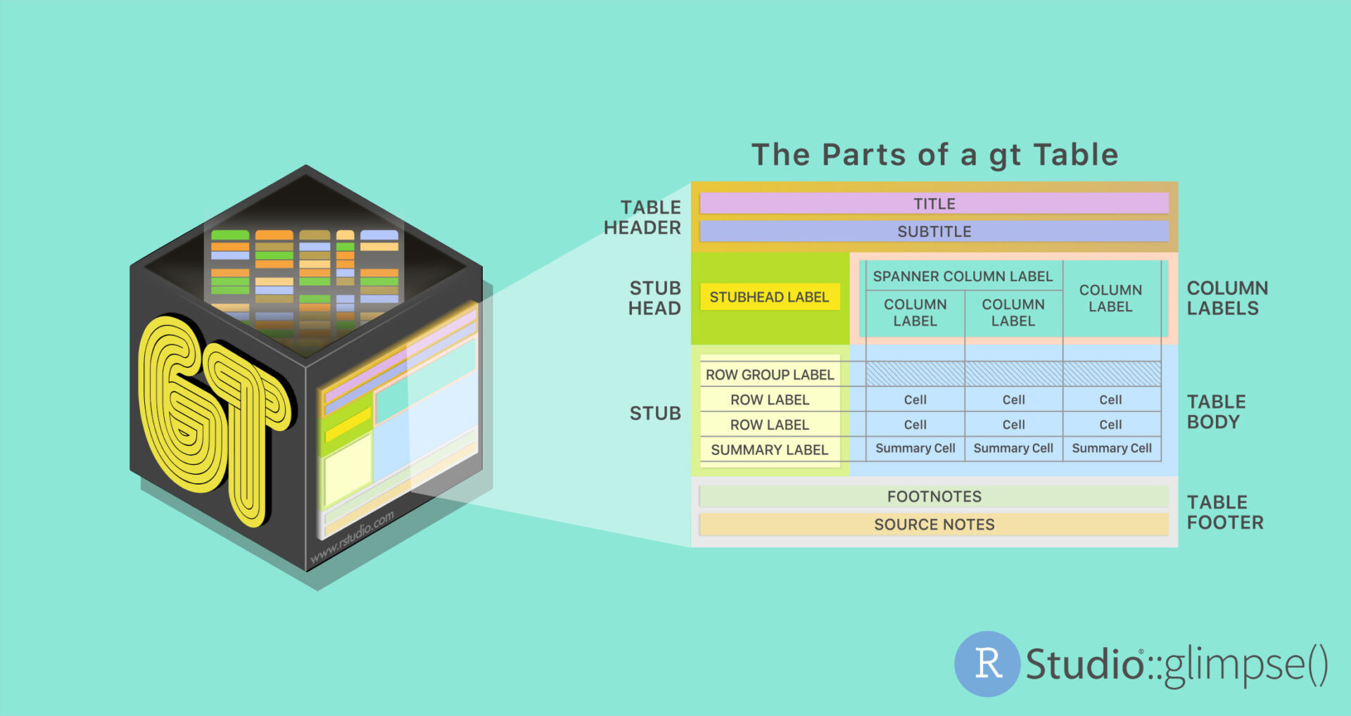
What is {gt} tables?
As we delve into the latest enhancements of the gt package in R, let’s take a moment to appreciate what gt tables is and why it has become an indispensable tool for data scientists and analysts.
gt, short for “grammar of tables”, is a powerful R package designed to create rich, customizable tables. It stands out in the R ecosystem for its ability to elegantly handle the presentation aspect of data analysis. With gt, users can transform basic data frames into professionally styled tables that are not only informative but also visually compelling.
This package excels in its flexibility and ease of use, allowing for detailed adjustments to table formatting, style, and layout. It supports a variety of functionalities such as merging cells, adding footnotes, integrating conditional formatting, and much more, making it a versatile choice for a wide range of applications.
As we explore the new features of gt, we will see how it continues to evolve, further enhancing its capabilities to meet the growing demands of data visualization and reporting in the R community.
Nanoplots, interactive plots in your gt table
Nanoplots are compact, interactive visualizations designed for inclusion in gt tables. Their main features include:
Compactness: Designed to be simple and space-efficient, suitable for embedding in tables.
Basic Interactivity: Users can interact with the plots, like hovering over data points to see values.
Variety of Plot Types: Supports different plot styles such as line, bar, and boxplot.
Customizability: Offers options for customization, including formatting and labeling.
The cols_nanoplot() function in gt is used to create nanoplots. It allows the selection of specific columns for data, which are then represented in the chosen plot style. These plots can display data compactly and interactively, making them a useful tool for enhancing the presentation of data within tables.
Line plots
Below is an example of a nanoplot (plot_style = "line") in a gt table. The plot shows the monthly close price of the S&P 500 from 2016 to 2023.
Hover to reveal data points!
You can hover over the nanoplots below to see the values of the data points. If you hover over the left-most part of the chart area you can also see the range of values in the plot.
Show the code
GSPC_2016_2023 |>rename_with(~str_remove(., "close_"), starts_with("close_")) |>arrange(-year) |>gt(rowname_col ="year") |>tab_header(title =md("**SP500** performance by month, 2016 - 2024"),subtitle ="Monthly Close Price from Yahoo Finance" ) |>tab_stubhead(label =md("**Year**")) |>cols_nanoplot(columns =everything(),new_col_name ="nanoplots",autohide =FALSE,new_col_label =md("*Monthly Close Price*"),options =nanoplot_options(data_line_stroke_color ="#E91E63",data_area_fill_color ="#E91E63",data_point_fill_color ="#E91E63" ) ) |>cols_hide(columns =c(Feb, Mar, May, Jun, Aug, Sep, Nov, Dec)) |>fmt_currency(columns =c(Jan:Oct), currency ="USD") |>cols_label(Jan ="Q1",Apr ="Q2",Jul ="Q3",Oct ="Q4" ) |>cols_align(align ="center", columns = nanoplots) |>tab_footnote(footnote ="Source: Yahoo Finance",locations =cells_column_labels(columns = nanoplots) ) |>opt_align_table_header(align ="left") |>tab_options(heading.padding =px(3),table.font.size ="14px") |>tab_source_note(source_note =md("Data is sourced from `Yahoo Finance` using the **quantmod** package." )) |>tab_options(table.width =pct(100))
SP500 performance by month, 2016 - 2024
Monthly Close Price from Yahoo Finance
Year
Q1
Q2
Q3
Q4
Monthly Close Price1
2023
$4,076.60
$4,169.48
$4,588.96
$4,193.80
2022
$4,515.55
$4,131.93
$4,130.29
$3,871.98
2021
$3,714.24
$4,181.17
$4,395.26
$4,605.38
2020
$3,225.52
$2,912.43
$3,271.12
$3,269.96
2019
$2,704.10
$2,945.83
$2,980.38
$3,037.56
2018
$2,823.81
$2,648.05
$2,816.29
$2,711.74
2017
$2,278.87
$2,384.20
$2,470.30
$2,575.26
2016
$1,940.24
$2,065.30
$2,173.60
$2,126.15
Data is sourced from Yahoo Finance using the quantmod package.
1 Source: Yahoo Finance
Boxplots
Among these, the “boxplot” nano plot is particularly useful for summarizing data distributions directly within a table cell. This feature enhances the ability to visualize and compare distributions across different groups or categories, providing a more intuitive and immediate understanding of the data. For more details, you can visit the Posit blog.
Hover to reveal data points!
You can hover over the boxplots below to see the values of the data points.
Boxplot Analysis of Bill, Flipper, and Body Measurements
Species
Bill Length (mm)
Bill Depth (mm)
Flipper Length (mm)
Body Mass (mm)
Adelie
Gentoo
Chinstrap
Data taken from the penguins dataset in the palmerspenguins package.
Interactivity (…with style)
Another significant new feature is the introduction of interactive HTML tables. This advancement transforms the way tables are created and interacted with in R, offering a more dynamic and engaging user experience. With this update, gt tables become not just a means of displaying data, but an interactive tool for data exploration and presentation. This enhancement aligns with the ongoing evolution of gt as a comprehensive solution for data visualization in R, catering to the growing demands for interactivity in data presentation.
Show the code
towny_tbl_styled <- towny_tbl |> dplyr::arrange(desc(population)) |>gt() |>fmt_number(decimals =1) |>fmt_integer(population) |>cols_label_with(fn =~ janitor::make_clean_names(., case ="title") ) |>data_color(columns = density,palette ="Blues" ) |>data_color(columns = population,palette ="Reds" ) |>tab_style(style =cell_fill(color ="gray98"),locations =cells_body(columns =c(latitude, longitude)) ) |>tab_style(locations =cells_body(columns = name),style =cell_text(weight ="bold") ) |>opt_interactive(use_filters =TRUE,use_compact_mode =TRUE,use_text_wrapping =FALSE )## Adding a header and footertowny_tbl_header <- towny_tbl_styled |>tab_header(title =md("**Population** and **Density** Data"),subtitle ="Arranged from largest to smallest municipality" ) |>opt_align_table_header(align ="left") |>tab_options(heading.padding =px(1))towny_tbl_header |>tab_source_note(source_note =md("Data taken from the `towny` dataset in the **gt** package." )) |>tab_footnote(footnote ="Density here is the population divided by the land area.",locations =cells_column_labels(columns = density) ) |>tab_footnote(footnote ="Population values obtained from the 2021 census.",locations =cells_column_labels(columns = population) ) |>opt_footnote_marks(marks =c("†", "‡")) |>opt_footnote_spec(spec_ref ="i", spec_ftr ="i")
Population and Density Data
Arranged from largest to smallest municipality
Data taken from the towny dataset in the gt package.
† Population values obtained from the 2021 census.
‡ Density here is the population divided by
the land area.
Closing thoughts
As we’ve explored some of the intriguing new features in the gt package, it’s clear that gt tables are evolving into an even more powerful tool for data visualization and presentation. With innovations like nanoplots adding a new dimension of interactivity and visual appeal to our tables, the possibilities for data representation are expanding. The practicality of gt tables, combined with their increasing flexibility and style, makes them an essential part of any data scientist’s toolkit.
As this journey through the gt package’s latest offerings comes to a close, remember that this is just the tip of the iceberg. Stay tuned for future posts where we’ll dive deeper into the gt tables’ feature set, uncovering more ways to bring data to life. Whether you’re a seasoned data analyst or just starting out, the evolving landscape of gt tables promises to offer something new and exciting for everyone. Let’s continue to explore and innovate together in the world of data visualization!