Visualizing Crime Patterns in Chicago: An Insightful 2015 Retrospective
From Numbers to Maps: Decoding Chicago’s Crime Data
Dive into an analytical exploration of Chicago’s 2015 crime data using interactive maps and dynamic tables, bringing numbers to life.
gt
tables
news
Author
Alex Labuda
Published
January 30, 2024
2015 Chicago Crimes: Mere data or deep insights?
[WORK IN PROGRESS]
Welcome to a deep dive into the world of data visualization and analysis, focusing on one of the most pressing urban issues: crime. In this blog post, we’re going to explore the intricate patterns of crime in Chicago for the year 2015. Leveraging the power of Leaflet for interactive mapping and the versatility of {gt} tables, we’ll uncover the hidden stories behind the numbers.
This journey isn’t just about numbers and statistics; it’s about understanding the geographic distribution and frequency of various types of crimes in one of America’s largest cities. We’ll visualize this data in a way that’s both insightful and accessible, even if you’re not a data scientist. From the most common crimes to the hotspots of criminal activities, our analysis will provide a comprehensive look at the crime landscape of Chicago in 2015.
So, whether you’re a data enthusiast, a policy maker, a Chicago resident, or simply curious, join us as we map out the contours of crime in the Windy City, discovering patterns and insights that could inform future strategies and solutions.
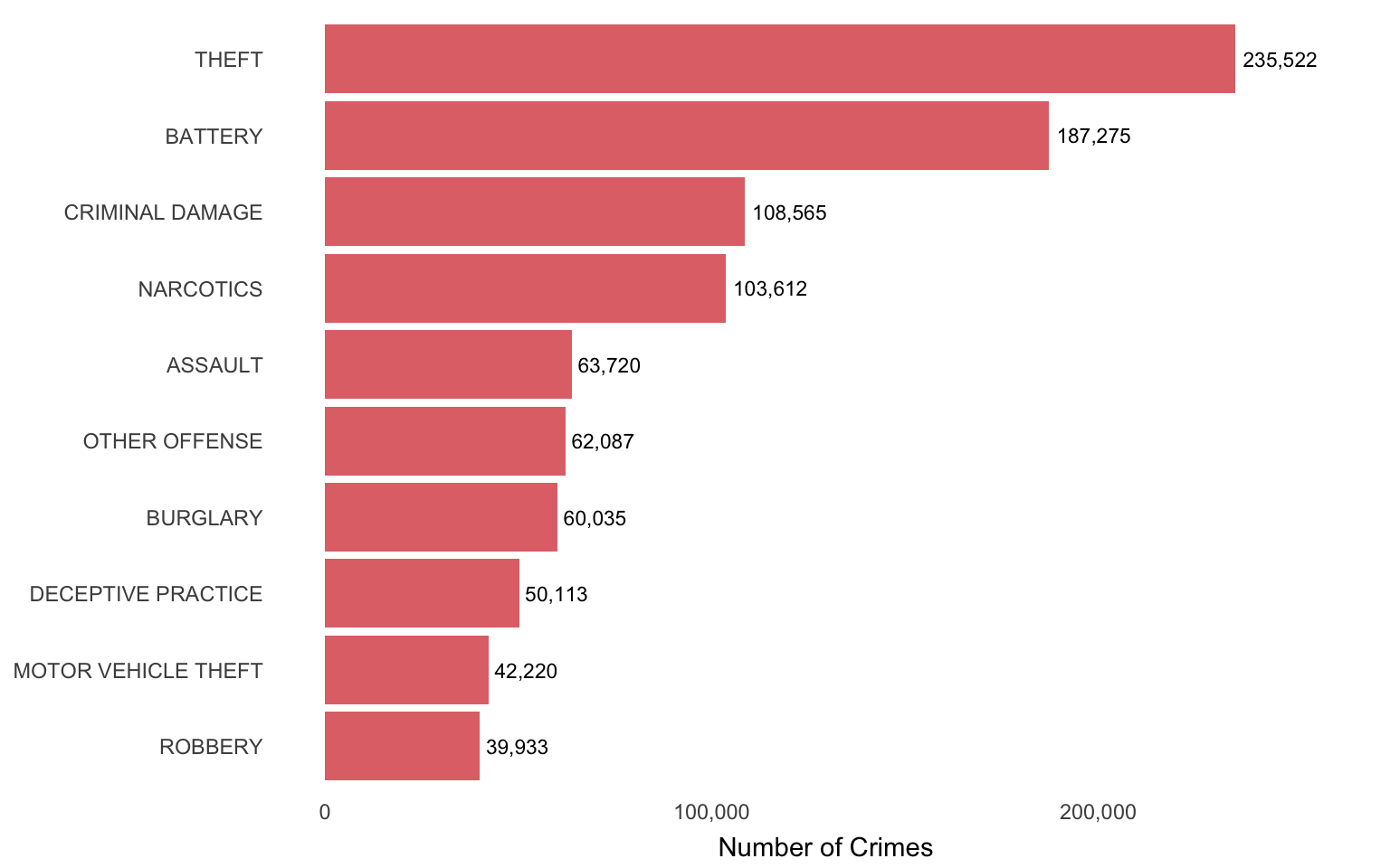
The Most Common Crimes in Chicago (2015)
Show the code
# Calculate the maximum n value with an offsetmax_n_offset <- chicago_crime_full_tbl %>%count(primary_type, sort =TRUE) %>%head(10) %>%summarise(max_n =max(n) *1.10) %>%pull(max_n)chicago_crime_full_tbl |># bar plot of most frequent crimescount(primary_type, sort =TRUE) |>head(10) |>ggplot(aes(x =fct_reorder(primary_type, n), y = n)) +# Add data labelsgeom_text(aes(label = scales::comma(n)), hjust =-0.1, size =3) +scale_y_continuous(labels = scales::comma, limits =c(0, max_n_offset) ) +geom_col(fill ="#D22B2B", alpha =0.7, linewidth =0.2) +coord_flip() +labs(title =NULL,x =NULL,y ="Number of Crimes" ) +theme(panel.grid =element_blank(),plot.title =element_text(size =13, hjust =-0.3),axis.title.x =element_text(size =11, vjust =-0.2) )
How do the top 10 crimes compare over the years?
Hover to reveal data points!
You can hover over the nanoplots below to see the values of the data points. If you hover over the left-most part of the chart area you can also see the range of values in the plot.